You are using an out of date browser. It may not display this or other websites correctly.
You should upgrade or use an alternative browser.
You should upgrade or use an alternative browser.
Upgrade/Project New Site Logo Workshop
- Thread starter xenonph
- Start date
- Joined
- Jun 16, 2003
- Messages
- 5,728
- Solutions
- 7
- Reaction score
- 4,163
- Points
- 151
- Favorite Pinball Machine
- TMNT
- Joined
- Jun 16, 2003
- Messages
- 5,728
- Solutions
- 7
- Reaction score
- 4,163
- Points
- 151
- Favorite Pinball Machine
- TMNT
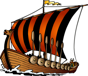
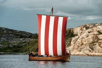
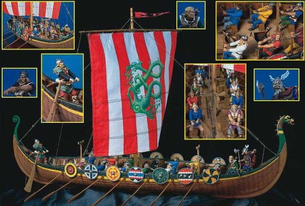
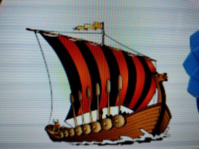
First ship at top, second ship at bottom.
They both look fantastic, if a tiny bit large, though they are sailing in different directions?

- Joined
- Nov 10, 2015
- Messages
- 3,587
- Solutions
- 26
- Reaction score
- 3,198
- Points
- 151
- Favorite Pinball Machine
- Congo
If I lower the Same Player Shoots Again, I could fit the ship up top?
Or what about putting it on top of the Nirvana word? Like Santa Clause was?
Or what about putting it on top of the Nirvana word? Like Santa Clause was?
- Joined
- Jun 16, 2003
- Messages
- 5,728
- Solutions
- 7
- Reaction score
- 4,163
- Points
- 151
- Favorite Pinball Machine
- TMNT
If I lower the Same Player Shoots Again, I could fit the ship up top?
Might be worth a look, it would look more central, though the colour of the ship fits the lower lettering.
Another idea I had, was to have 2 ships at the bottom either side of the Nudging Necessary, looks like they should fit and give a more balanced look, you may need to nudge the bumpers over a bit?
- Joined
- Nov 10, 2015
- Messages
- 3,587
- Solutions
- 26
- Reaction score
- 3,198
- Points
- 151
- Favorite Pinball Machine
- Congo
Lol i was just writing a message to say same thing!Might be worth a look, it would look more central, though the colour of the ship fits the lower lettering.
Another idea I had, was to have 2 ships at the bottom either side of the Nudging Necessary, looks like they should fit and give a more balanced look, you may need to nudge the bumpers over a bit?
I am also thinking maybe remove the Shoot Again, and place the bumper there. So only 1 bumper in center?
- Joined
- Jun 16, 2003
- Messages
- 5,728
- Solutions
- 7
- Reaction score
- 4,163
- Points
- 151
- Favorite Pinball Machine
- TMNT
I am also thinking maybe remove the Shoot Again, and place the bumper there. So only 1 bumper in center?
Not sure on the idea as I think the Shoot Again looks great where it is, also like the two bumpers displaying 21. I think it should look good with the two at the bottom without looking too crowded... I even had the thought, hey we could throw another long boat above the Shoot Again, then thought, mmmaybe not...
- Joined
- Jun 16, 2003
- Messages
- 5,728
- Solutions
- 7
- Reaction score
- 4,163
- Points
- 151
- Favorite Pinball Machine
- TMNT
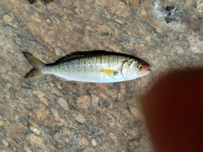
Just been out trying to catch some fish for Friday... only caught one...
I like the bigger boats slightly raised as you have them here...
Fish attached a herring.
I like the bigger boats slightly raised as you have them here...
Fish attached a herring.
Attachments
- Joined
- Nov 10, 2015
- Messages
- 3,587
- Solutions
- 26
- Reaction score
- 3,198
- Points
- 151
- Favorite Pinball Machine
- Congo
We just had Smelt dipping going on here.Just been out trying to catch some fish for Friday... only caught one...
I like the bigger boats slightly raised as you have them here...
Fish attached a herring.
The riverbanks were filled with people for miles and miles!

Cowlitz River smelt fishing
The southern distinct population segment (DPS) of eulachon, commonly referred to as "Columbia River smelt," supports a popular recreational fishery in Southwest Washington.
- Joined
- Jun 8, 2003
- Messages
- 2,785
- Solutions
- 3
- Reaction score
- 2,201
- Points
- 131
- Favorite Pinball Machine
- Drop-A-Card
- Joined
- Jun 16, 2003
- Messages
- 5,728
- Solutions
- 7
- Reaction score
- 4,163
- Points
- 151
- Favorite Pinball Machine
- TMNT
If you look close you can see @JonPurpleHaze steering the ship!
Sure hope he doesn't hit that bumper!
Sure hope he doesn't hit that bumper!

Attachments
- Joined
- Jun 16, 2003
- Messages
- 5,728
- Solutions
- 7
- Reaction score
- 4,163
- Points
- 151
- Favorite Pinball Machine
- TMNT
A little experiment...
Okay... I think I prefer the fireworks and no, just do not replace the dots on the i's with bumpers!
- Joined
- Jun 8, 2003
- Messages
- 2,785
- Solutions
- 3
- Reaction score
- 2,201
- Points
- 131
- Favorite Pinball Machine
- Drop-A-Card
- Joined
- Jun 16, 2003
- Messages
- 5,728
- Solutions
- 7
- Reaction score
- 4,163
- Points
- 151
- Favorite Pinball Machine
- TMNT
A little experiment...
Well if you really want to experiment can you change the lettering of FLIPPER to FLIPHER!

- Joined
- Jun 16, 2003
- Messages
- 5,728
- Solutions
- 7
- Reaction score
- 4,163
- Points
- 151
- Favorite Pinball Machine
- TMNT
I used to have a vikings site
By the Gods of Valhalla, this is woke before woke was woken!

General chit-chat
You can interact with the ChatGPT Bot in any Chat Room and there is a dedicated room. The command is /ai followed by a space and then your ? or inquiry.
ie: /ai What is a EM Pinball Machine?
ie: /ai What is a EM Pinball Machine?
- No one is chatting at the moment.
-
Chat Bot Mibs:
mesrine13 has left the room. -
Chat Bot Mibs:
ettore has left the room. -
Chat Bot Mibs:
amigajohn has left the room. -
Chat Bot Mibs:
Morinehtar has left the room. -
Chat Bot Mibs:
MrConductor has left the room. -
Chat Bot Mibs:
chris9795 has left the room. -
Chat Bot Mibs:
knaxit has left the room. -
Chat Bot Mibs:
dw1 has left the room. -
Chat Bot Mibs:
allamain has left the room. -
Chat Bot Mibs:
johnny4545 has left the room. -
Chat Bot Mibs:
mranderson has left the room. -
Chat Bot Mibs:
PinballFan1984 has left the room. -
Chat Bot Mibs:
Darkchylde has left the room. -
Chat Bot Mibs:
Jeff X has left the room. -
Chat Bot Mibs:
SireB has left the room. -
Chat Bot Mibs:
francisghost has left the room. -
Chat Bot Mibs:
grumpycat has left the room. -
Chat Bot Mibs:
KingKongs has left the room. -
Chat Bot Mibs:
Marthani has left the room. -
Chat Bot Mibs:
sandrosws has left the room. -
Chat Bot Mibs:
GUNSMOKE has left the room. -
Chat Bot Mibs:
lshjs has left the room. -
Chat Bot Mibs:
Printz has left the room. -
Chat Bot Mibs:
id11179 has left the room. -
Chat Bot Mibs:
Thalamus has left the room.


