Upgrade/Project New Site Logo Workshop

We can post this link in forum maybe a couple days before Easter, to give hint about cow?

Your call, I think you may have already spilt the milk... :cry:


Let's see how it matures, loves me a bit of cheese...

I was thinking that link would be better posted when 'he' has arisen. ✝️
 
Your call, I think you may have already spilt the milk... :cry:

Let's see how it matures, loves me a bit of cheese...

I was thinking that link would be better posted when 'he' has arisen. ✝️
I removed that part of my post.
Hopefully not too many saw it.
 
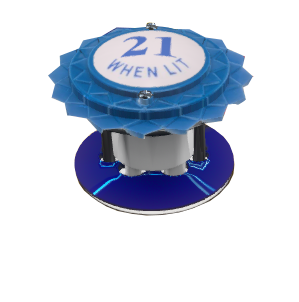
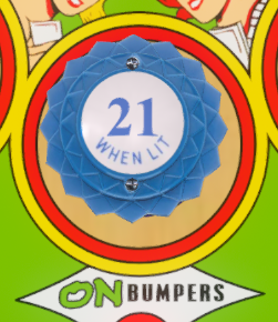
So I have been trying to get good snapshot of bumper.
I used Big Deal (Williams, 1963).
It was the only table I found that lit up the bumper.
Sadly when lit, the lettering is barely seen.
So here it is unlit...
I added the 21 to it.
Is this what you were talking about?
Or did you want a top down view?
 

Attachments

  • bbb.PNG
    bbb.PNG
    80.1 KB · Views: 1
Is this what you were talking about?
Or did you want a top down view?

Looks good, maybe angled down a little to display more of the bumper cap?
 
Looks good, maybe angled down a little to display more of the bumper cap?
It is hard to toggle in Live View.
I can either get top down, like this..
Capture2.PNG

Or like the previous one.
I think maybe I can mess with the POV numbers to get the perfect viewing angle.
But with the Live View it cannot be done that I can see.
Also anything other than live view will be small because of my screen resolution.
I will need to rig the POV to put that bumper in center of screen, and then tweak the other settings to get angle.

Here is sample with it on the logo.
aaa4.png
 
Last edited:
But with the Live View it cannot be done that I can see.

Ah, OK, it's been that long, I have no idea what 'Live View' is... Now what I would do is replace the playfield image with a pure black image, maybe scale up the pop bumper to a larger size then mess POV numbers, run take a shot, muse upon your achievement, then maybe mess with it some more.
 
Ah, OK, it's been that long, I have no idea what 'Live View' is... Now what I would do is replace the playfield image with a pure black image, maybe scale up the pop bumper to a larger size then mess POV numbers, run take a shot, muse then upon your achievement, then maybe mess with it some more.
Live View was added to VPX8.

Great idea!
I can just move the bumper!

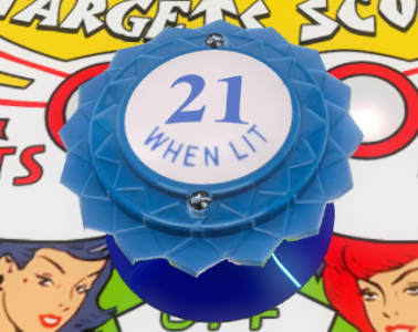
How is this angle?
Capturea.PNG
 
Here is sample with it on the logo.

Just saw that... the image renders well, with the angle changed ever so slightly I think it should be good. I think, looking at it, it maybe best downsized slightly and placed either side of the 'Nudging Necessary!' and then maybe a custom spot target between the Pinball Nirvana?
 
How is this angle?

Looks better I think, though as you know it's not until it's actually part of the logo can you really judge the 'look'...maybe one in between?
 
Just had another crazy idea... Not sure it would work or look right, but...

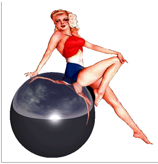
What if you can rotate Bettie to lean back on the ball, move the ball with bettie up as much as possible and maybe place small zipper flippers underneath. :mrgreen:
 
Just finished cutting dads hair.
It was a chore. lol
Now he doesn't look like Grizzly Adams anymore.
I have been trying to cut his hair for weeks, but his dementia or his sleeping always got in the way.
So I didn't want to pass this opportunity up.

Ok back to work on logo.
Great idea for the flippers!
It can be done!!
 
I figured out how to do this!
I use the Z Offset to bring object closer, and use Y Offset to put object in window.
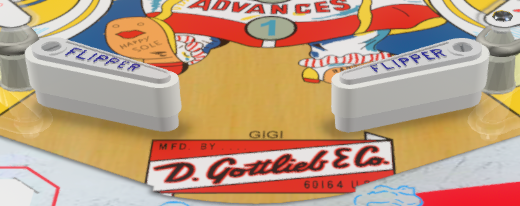
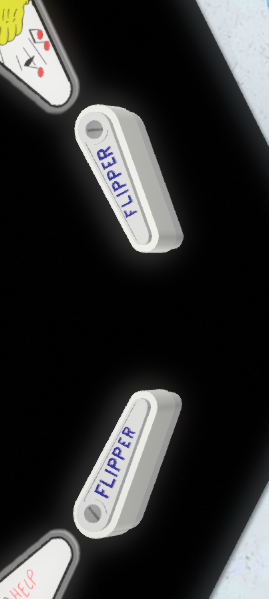
Here are the flippers we can use. (After I hand cut them out.)
Capturec.PNG

I can't figure out that Live View, so this will work!
 
Perhaps a more top down view and why not just delete the playfield with an all black background you won't have to hand cut anything?
 
Here is a more top down view.
Used the black playfield, and this is what it looks like when I don't hand cut it.
bbb2.PNG
Here is pic i used...
Captured.PNG
 
Looks okay, I like the POV, though maybe you could just copy and paste the flipper to a new table and scale it up to perhaps improve the resolution?
 
There were too many parts to scale it up.
So I just kept zooming in with Z Scale, and just had 1 flipper on screen per screenshot.
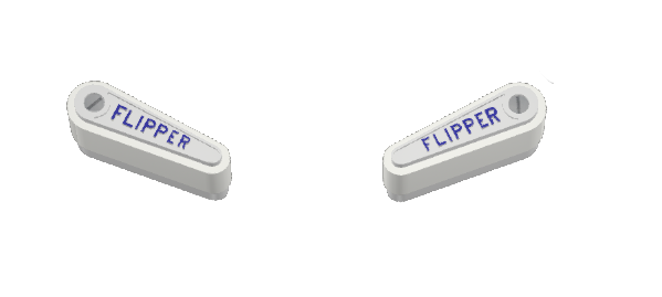
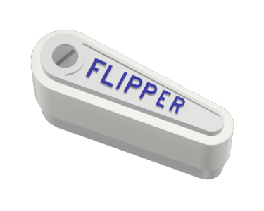
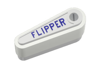
Here is left and right flipper....

Here is how it looks full size on the logo...
aaa5.png
 

Attachments

  • Capturefa.PNG
    Capturefa.PNG
    92.7 KB · Views: 3
  • Capturefb.PNG
    Capturefb.PNG
    92.2 KB · Views: 3
Last edited:
Definitely looks well sharp enough, though somewhat rendered oversized...:tenisclap:
 
Definitely looks well sharp enough, though somewhat rendered oversized...:tenisclap:

It is easy to make smaller, but not so easy to make bigger.
Making it smaller will not diminish quality. but trying to make it bigger will, unless AI us used.
 
I actually think the first flippers POV was better, that way the pinball could sit behind the flipper nd it would look right.
With this POV, the ball will need to be more towards the top of the flipper to look right.
What do you think?

It would also match that bumper POV!
 
I actually think the first flippers POV was better, that way the pinball could sit behind the flipper nd it would look right.
With this POV, the ball will need to be more towards the top of the flipper to look right.
What do you think?

Ah, so the height of the flipper image is larger with that image POV, though to me the perspective I imagine won't look correct, maybe going further top down or completely so if needs be might work better?
 
Though I was thinking giving Bettie enough lay back would afford more logo headroom even if we have to nudge the ball up to fit the flippers?
 
When I make the flipper smaller, it looks like it will be fine with the 2nd POV.
This is at 200 height.
aaa6.png

I can move chicka and ball, but the bumpers will need to have POV changed on them to match the flippers.
 
but the bumpers will need to have POV changed on them to match the flippers.

Is this earlier render perhaps a near enough match?


Though I was looking to make it appear as the logo pinball is resting upon the flippers, so the flippers would need to be made smaller to fit and/or also clipped to size. I think it would look good with the lower part of the flipper image clipped off to fit.
 
Cutting off everything below the R might be the best way to maximise the image?
 
General chit-chat
Help Users
You can interact with the ChatGPT Bot in any Chat Room and there is a dedicated room. The command is /ai followed by a space and then your ? or inquiry.
ie: /ai What is a EM Pinball Machine?
  • No one is chatting at the moment.
      Chat Bot Mibs Chat Bot Mibs: Lbyms has left the room.
      Back
      Top