Upgrade/Project New Site Logo Workshop

Tis fine but don't like the gold border much. Nice and simple
Yes I was entering into tired phase, and was about to start dotting the I's with bumpers! lol
Never work on stuff when tired!
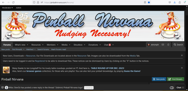
 
Ok with alternate logo. (You can see this one much better!)
aaa05.png

The ladies are 40 arrow key presses from edges, to keep them symetrical.
I tried 50, and it was too close to Pinball Nirvana word.
 

Attachments

  • bbb3.png
    bbb3.png
    156.7 KB · Views: 3
Last edited:
Can you see it? I can make it smaller.

I can see it, then again I know it's there, best let shiva decide, just thought it would be a nice subtle addition, it was one of his cutting edge recreations at the time.
 
I can see it, then again I know it's there, best let shiva decide, just thought it would be a nice subtle addition, it was one of his cutting edge recreations at the time.
I chose that one instead of black silhouette, so it doesn't stick out with the white background.
Otherwise eyes would go straight to black spot!
 
And here with "Nudging Necessary!" bucket filled with same red that is on bumpers.

aaa07.png

Me likey!
 
There was also the original Bally Star Trek which shiva also recreated with that same dedication, so maybe the same left corner?

 
Nice, nice, though maybe both symbols moved inward for a more balanced look.
 
Nice, nice, though maybe both symbols moved inward for a more balanced look.

How is this?...

aaa09.png

You ready to test this High Res logo on your grey theme?
See how 2400x400 looks?
This is our first Higher Res logo!
Once we get a better pinball image, we can convert the others to new 2400x400 template.
 
Looking great mate, subtle and sweet...:tenisclap:
 
Ok snapped...
 

Attachments

  • sss.png
    sss.png
    1.6 MB · Views: 4
Ok snapped...
Thanks bro! I appreciate it!
I see a successful test!
We leave the res numbers as they are in ACP, and just use the higher res logo pics!

Can't wait to get new pinball image, so we can do the Original Pinball Nirvana logo in High Rez!!
 
Looks nice. I thought if you really wanted trigon in there, you can add a very faded image of my avatar as a "ball reflection" to the ball image on the left. God, how many versions of playboy did I do?
 
Looks nice. I thought if you really wanted trigon in there, you can add a very faded image of my avatar as a "ball reflection" to the ball image on the left. God, how many versions of playboy did I do?
Great idea!
I will need to work on my fading skills to accomplish that.
I just haven't tried fading an image yet.
But I am a quick learner!
I think I better do this after I get some sleep though.
 
I can do this pretty easy in photoshop, and add some hidden references to other games as well as I have everything as a psd file. The icons are too noticeable in the banner, and I have other games as well as shivaEngine/fpx that I could sneak in, maybe even wpcMame and VP dev references. Great idea Steve, should have thought of it myself.
Have the Oilers vs Bruins tonight though to watch with the GF. :)
 
I agree! More Icons the better.
I was actually looking for your Shiva Engine icon, before StevOz mentioned it.
I was thinking of making something like Led Zepplin has on that one album, where they have those symbols lined up.
But I never got around to it.
Here is logo without the icons.
You can add whatever you like to it.
PN-Logo-Shiva25thAnn-2400x400.png

Here is blank template without anything at 2400x400 res. (In case you want to start from scratch)
000 blank sides template 2400x400.png
 
Lots more involved than I thought. Had to remake the entire banner including background as I needed to double the size. Still, the big problem is the display size, even with a 4k it's a bit hard to see the references, especially on the fixed width designs that PN has, but this is what I have so far. Had to redo all the text as well, but it's a lot clearer. How it will look at different resolutions remains to be seen though. I also decided to add some images to the logo, Steve might remember some of these, as they are from quite a long time ago.
I'm heading to bed, so if you guys can comment appreicate it while I "sleep on it"
 

Attachments

  • shivasite_25_Full_Banner.png
    shivasite_25_Full_Banner.png
    2.2 MB · Views: 5
Last edited:
Lots more involved than I thought. Had to remake the entire banner including background as I needed to double the size. Still, the big problem is the display size, even with a 4k it's a bit hard to see the references, especially on the fixed width designs that PN has, but this is what I have so far. How it will look at different resolutions remains to be seen though. I also decided to add some images to the logo, Steve might remember some of these, as they are from quite a long time ago.
I'm heading to bed, so if you guys can comment appreicate it while I "sleep on it"
Looks great!!
Those are things I don't know how to do yet!
Damn looks good!
 
I am seeing some bleed through the black borders of the Pinball Nirvana text, which just appears to add a rough edge and blur to lettering also with the Nudging Necessary! has the a similar same blur with an orange shadow alignment issue?
 

Attachments

  • fringe.png
    fringe.png
    1.8 MB · Views: 3
yeah. I did a second logo and just put it overtop, but forgot to unrender the one below. What can I say, it's late here... :)

Here's a quick fix.
 

Attachments

  • shivasite_25_Full_Banner2.png
    shivasite_25_Full_Banner2.png
    2.2 MB · Views: 2
Last edited:
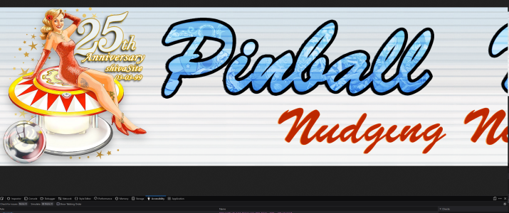
Looking at this, I realized that just expanding the text as a image causes problems with the text logo as it tears at the edges and it loses it's shape with the constant resizing so the letters become harder to read and the black outlines become misshapen. I helped doing the orginal logo all those years ago, so I decided to redo the text as a proper font and not a image as before. For reference (this is using my image size BTW) the text font is Brush Script MT, set to all bold and italic settings, at 500px. This means we can now change whatever we want for the text logo, including the colors, add gold effects etc...
The downside is it is a font, so the fonts doesn't join together, so there are little gaps. When I did the orginal, I had to rasterize the text to make it a image, and then redraw the text curves to remove the gaps, fill them in and then save it as a complete image. Here is a sample I just started on just using the Brush Script MT Font.
 

Attachments

  • PN_Banner_mk1.png
    PN_Banner_mk1.png
    508.1 KB · Views: 4
Last edited:
General chit-chat
Help Users
You can interact with the ChatGPT Bot in any Chat Room and there is a dedicated room. The command is /ai followed by a space and then your ? or inquiry.
ie: /ai What is a EM Pinball Machine?
  • No one is chatting at the moment.
  • Chat Bot Mibs Chat Bot Mibs:
    Ducati66 has left the room.
  • Chat Bot Mibs Chat Bot Mibs:
    pinballgirlBR has left the room.
  • Chat Bot Mibs Chat Bot Mibs:
    arthab has left the room.
  • Chat Bot Mibs Chat Bot Mibs:
    bor74 has left the room.
  • Chat Bot Mibs Chat Bot Mibs:
    ROCJR73 has left the room.
  • Chat Bot Mibs Chat Bot Mibs:
    sparky has left the room.
  • Chat Bot Mibs Chat Bot Mibs:
    scutters has left the room.
  • Chat Bot Mibs Chat Bot Mibs:
    vincez28 has left the room.
  • Chat Bot Mibs Chat Bot Mibs:
    rocker has left the room.
  • Chat Bot Mibs Chat Bot Mibs:
    unomismo has left the room.
  • Chat Bot Mibs Chat Bot Mibs:
    Gamegod2x has left the room.
  • Chat Bot Mibs Chat Bot Mibs:
    DocRazor has left the room.
  • Chat Bot Mibs Chat Bot Mibs:
    ejrcooney has joined the room.
  • E @ ejrcooney:
    B2S server.exe Version 2.5.0.320 How can you make the B2SDMD stay on Visible. Make it the default instead of hidden. Did new install of 10.8 final have many tables I would have to open to change to visible instead of hidden. Any help would be much appreciated.
    Quote
  • xenonph @ xenonph:
    @ejrcooney Try right clicking on backglass with mouse pointer, and you should see B2S DMD Visibility setting at top of window.
    Quote
  • E @ ejrcooney:
    Want to make visible the default. Right now it is set on hidden.
    Quote
  • Quote
  • xenonph @ xenonph:
    I sent you message with pic showing where to make visible adjustment.
    Quote
  • Chat Bot Mibs Chat Bot Mibs:
    Pinped has left the room.
  • Chat Bot Mibs Chat Bot Mibs:
    daleks12 has left the room.
  • Chat Bot Mibs Chat Bot Mibs:
    Stephen has left the room.
  • Chat Bot Mibs Chat Bot Mibs:
    docdoc has left the room.
  • Chat Bot Mibs Chat Bot Mibs:
    Exnihilo_Mundus has left the room.
  • Chat Bot Mibs Chat Bot Mibs:
    angmarg52 has left the room.
  • Chat Bot Mibs Chat Bot Mibs:
    tully619 has left the room.
      Chat Bot Mibs Chat Bot Mibs: tully619 has left the room.
      Back
      Top